This week has been a busy one in the studio, I’ve been working on a number of new paintings, trialling a plethora of composition ideas, gathering more images for my source image archive and playing around with different mediums. One of the studies I have been working on is a series of coloured paper collages inspired by some cropped figurative images – those which I usually use for my paintings. The series began as a loosening up exercise before beginning some new paintings, but I found it a really interesting way of reconsidering the form of the figures in my paintings. These works and some of my more recent paintings have led me to spend much of my time this week considering colour and tone within my work, and within figurative painting more broadly. I find it fascinating that we are often presented with depictions of the human body in exaggerated, enhanced or sometimes altogether different colours to that which we would usually encounter in the varied skin tones of humans, and yet we are still able to identify the figure in a work of art despite any variation in representational ‘colour accuracy’. Similarly to my considerations around decontextualizing the nude and explore recognisability, I wonder then if the body is such a widely recognisable subject – both because of it’s historical artistic context, and the universality of inhabiting and interacting with bodies – that ‘accurate’ colour representation in painting is of little importance.
Let us consider for example, Picasso’s Nude Woman With Necklace,1968. Within this painting, a woman is presented, reclined, with a necklace on, in tones of blue, green and white, all in Picasso’s signature cubist(?) style. Without alluding too much to the title, it is safe to say that this image is recognisable as female figure, despite there being – to my knowledge – no blue or green -skinned women roaming the planet in the 60’s…

Hester Finch Nude on turquoise with violet plant
Just as I have considered in relation to my own work, it is possible that we are only able to recognise these abstract-expressionist works as figurative art because of external influence, titling and past experience, however, I would argue that just as we are able to recognise faces in the drawings of infants, we are conditioned from a young age to recognise the normalised characteristics of a figure in a painting; such as a face, arms, legs, breasts, hands, feet etc. even if these details are disproportioned or coloured differently to their ‘real world’ counterparts. This links back to my writings on pareidolia, where I considered the notion of suggested nudity, context and the use of ‘explicit’ imagery in art.
In considering this use of colour, and how the plethora of human skin tones are often translated to rainbow hues in contemporary painting, I began to consider how some of my favourite figurative artists employ colour – be it ‘traditional’ or otherwise – in their own works. Hester Finch’s works show the way in which the shadows and tones of the human form can be translated into blues, greens, pinks, purples and reds, despite the subjects’ ‘real’ colour being much less vibrant. I really love the way in which Finch utilises a base colour that sometimes appears and a ghost outline, or patches in the background beneath the pastel marks in her works. The way she uses blocks of colour reminds me of some of my own experimentation, especially with my recent trials of collage.
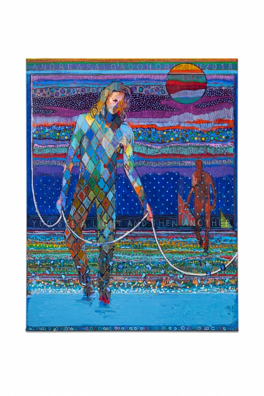
Andrew Salgado Horizon
Another contemporary painter who exemplifies the use of colour in figurative art is Andrew Salgado. I have been a fan of his since the first day I laid eyes on his paintings and it has been joyous to watch his practice develop further into the realms of expressionism, using colour, collage and mixed medias to enhance portraiture into a new exciting format. His works also exhibit a similar notion that I have proposed in my discussion on Picasso’s works: many of his figurative works use colour in patches and swathes that – unlike Finch – do not necessarily mimic the lines or structures of the body, yet the utilisation of a figure silhouette or profile means we are able to see the figure, despite a lack or traditional detail, shading and tone.
Within my own work, colour has always been important, but has also often been a conflict in my practice, when I struggle to draw the line between accurate representation and the stylised effect that is so successful in some of my previous works. This week, my experimentations have shown me how colour can be used in countless different ways, and often ‘real colour’ has no place in figurative painting, particularly if the work is intended to reframe or re-contextualise the body.